More Book Covers!
I received a lot of great feedback on my last post (Thanks everyone!) and spent the last few days creating some new mock-ups.
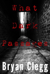
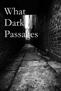
Option #4 was the overall winner last time, receiving far and away the most votes. I kept that one, with a few modifications: I darkened the red and changed the font size and adjusted the word locations on the page a bit.
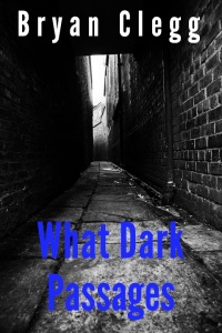
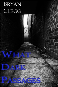
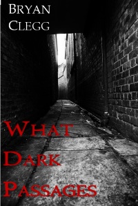
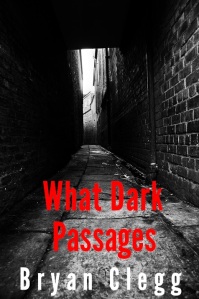
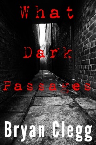
As for the new covers, I made a few using blue as the title cover instead of red. The reason is thematic. Through the novel, depression is a major theme, and depression is often linked to the colour blue. When I did my initial mock-ups a month or two ago, I nixed blue because I didn’t think it jumped from the page enough, but with the changes I’ve made to font, font size, and word location I think I could get away with it now. I still have red as an option as well, it is still easier to see and there are themes of anger in the novel as well, and yes, there is blood. Not a lot, but it’s there.
I also switched my name from the bottom to the top and moved the title to the bottom. I like this idea because my name can fit into that convenient dark spot above the light at the end of the alley and the title and sit on top of the ground. I also tried switching from a sans serif to a serif font. You’ll notice between the last two options my name dramatically decreases in size, yet in spite of that, it stands out better than it did before.
And so, here are the 5 new options.
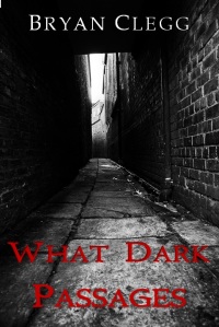
Option 5: Same fonts as the previous two, title centered on bottom on two lines. I really like these fonts. Is it just me or does the title stand out *slightly* better on the previous option? It’s pretty close.
Remember to let me know what you all think, and thanks for looking!
P.S. I just realized I didn’t cut/paste the images perfectly so there are white lines in some cases. My apologies. I made the files in MS Word and since WordPress won’t upload Word or PDF files as images, I print screen/pasted the images into MS Paint and made jpegs. Feel free to ignore those ugly white lines :).
Book Covers!
Today I’d like to talk about book covers. I’ve been working on mine off and on for the last few months and I think I’m close to deciding on a final version.
When I started thinking about what I wanted to do for the cover, I didn’t have a lot of ideas. All I really knew was I wanted it to feel dark and moody, something that suited my novel title, What Dark Passages, as well as the content within.
So I began to scour stock photo websites looking for an image I could use. Not wanting to do anything illegal, I made sure that I only searched images with explicit open licences or ones where a licence could be purchased. There are a lot of options out there, both for paid and for free. Finally, after searching through what seemed like thousands of images, I came across one that evoked exactly the kind of feeling I wanted: a dark alley filled with shadows.
This is the original image:
Pretty cool right? After finding the image, I set about making the cover. I won’t get into the steps here, as there are a number of helpful sites out there that cover those (I used them), and it was surprisingly easy!
The next step was to try and find a cool font for the title and my name. A lot of guides I found online recommended against using the stock fonts in Word, something I definitely agree with. Word is great, but the fonts included can be…lacking in emotion.
A few dozen downloads later, I had a series of options. Once again, I had to check the licence info for every download and for anyone else using fonts I recommend you read up on it too. Some websites may host a font for free, but don’t actually have the right to distribute it. The best place to ensure you have the right to use a font is to get it directly from the source.
Next up was playing with where to place those fonts, what size to make them, and what colours to use. I experimented with a white font for the title but realized that simply wouldn’t work, as I wanted the title to be at the top and name at the bottom.
The white light at the end of the alley negates any attempt to use a white font for the title. I needed to pick a colour that would stand out. Red was the obvious choice. Eventually I came up with a series of covers, some I like, some I don’t. I’ve decided to post them all here for your perusal. Here they are:
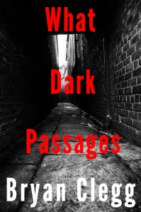
Option 2 – Decided to spread the title over three layers. The alley light isn’t as much of a problem as I feared, but it still interferes with the ‘a’ in Dark a bit.
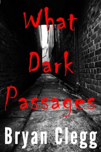
Option 3 – This one seems to work really well. I don’t think the light is a problem, and I kind of like the messy writing. Almost looks bloody.
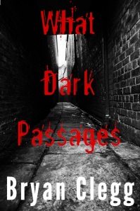
Option 5 – Darkened the red by about 30 points to get out any orangish hue, also added a slight dark to light gradient. Font is cleaner than the other messy one, but still has similar elements. Probably my front runner.
And there you have it – 5 different cover options, ending with my current favourite. Feel free to let me know which ones you like (or don’t like) and why.
Bad Habits
As I go through the editing process on my novel, I’ve noticed I have a number of bad habits in my writing. This isn’t surprising, everyone has bad habits, both professionals and amateurs.
For example – I’m reading a novel by a favourite author of mine, Steven Erikson. He’s published over a dozen novels and, in my opinion, they range from great to amazing. But I noticed something recently that surprised me – he has a habit of writing run-on sentences. On some pages, I found paragraph long sentences broken up by a half dozen commas!
Now, I don’t want to insinuate he’s a bad writer or I’m better than him in any way, because A. I think he’s amazing, and B. I could only dream of writing like he does. I just think that, in the grand scheme of things, littering your books with paragraph long sentences probably qualifies as a bad habit.
I have a lot of bad habits. I managed to pick some up on my own during re-reading, the rest had to be pointed out by my beta-readers. Here are some of my most common problems:
- I overuse the word “just”. I just can’t help myself. I cut my usage in half during editing.
- There was over 130 uses of “there was”. I’ve trimmed it down to less than 20.
- It seemed to be ok at first, but I also realized I overuse “seemed to”. I had over 70 instances, and it’s been trimmed down to less than 10.
- “That” is a generally extraneous word that I kept typing when I didn’t need to.
The good news is the above problems are easily fixed. Whoever came up with the ‘Find’ command deserves a giant hug. Seriously.
There were other problems, of course. I had a few sections where I was telling instead of showing, so I ended up writing in entirely new scenes to compensate. Those kinds of problems take a lot more time and effort to tackle, but they’re worth fixing.
What about my readers? Do any of you have bad habits in your writing?
Editing
Now that I’ve received feedback from as many beta readers as I believe I’m going to hear from (Less than half got back to me, something to note in the future), it’s time to start editing.
I tend to edit as I write. I’ve been known to spend over an hour working over a single paragraph, trying to get it to flow just right. The good news is, extra effort while writing my first draft should leave me with less work to do when it comes time to do a full-on edit. If we take into account the amount of time I spent going back and fixing things as I went, then I’m probably on my second or third draft by now.
That being said, I’m certainly not immune to making a boatload of mistakes. It’s the nature of the craft, when you’re so close to it you see things as you want them to be, not necessarily as they are. I still need to do a good, thorough edit just as much as anyone.
For a lot of writers, editing tends to be the most dreaded stage of writing, because it doesn’t feel creative. In fact, it almost feels the opposite, because you end up spending a lot of time deleting sections of writing that you put so much of yourself into.
In an early section of my book, one of my characters reads over a suicide note he’d been writing for two years. When I put his note together, I was structuring it off a few real-life ones I’d read online, while also using it as a tool to provide some backstory on the character. However, the note became a point of contention for a number of my readers, who pointed out that it was too long, too this, or not enough of that.
So, with that in mind, I spent the day re-writing the note to try and take into account any criticisms while also maintaining the original purpose. The interesting thing about re-writing is it takes a lot longer than writing the original. Here I am going back and forth between tabs, making sure I keep the really important points, deleting the less important ones, and restructuring the sentences with a slight change in voice. By the time I’d finished producing a second, and then third note, I’d spent three or four times longer than when I’d written it the first time.
It felt like hacking at a wooden statue with an axe, and then slowly gluing it back together in a different pose. But at the end of the day, if I’ve done my job correctly, the new pose should look better than the old one.
I’m thankful there aren’t a lot of sections that need to be totally re-worked like this, because I fear if there was I might get bored and frustrated, and not do the best job possible.
How do you, my readers feel about editing? Is it a strong or weak point for you? Do you dread it like I do?
Next Steps
Finishing my draft felt great. It was like getting a monkey off my back that had been crashing cymbals on my head for years. I wanted to do this for so long, and now I’m finally done, right?
Not even close!
There are so many steps to go, the list is almost discouraging to look at. I’m a writer, a creative guy, this stuff isn’t really my bag, ya know? I avoid lists like I avoid fist-sized spiders. But it needs to be done. Lucky for me I have a partner who is good at lists, tasks, and getting the type of stuff done that I consider boring. That doesn’t mean she’s going to do it for me, it just means she’s going to harass me until I do it. This is a good thing because otherwise it would take me a lot longer to get these things done.
So how did I figure out the steps? I’m fortunate because I’ve been able to draw from two sources on where to go from here. First is the fantastic website IndiesUnlimited. They just published a piece called I’ve Written a Book, How Do I Publish It?. In it, they run through a sixteen step process on how to take your book from first draft to published book. The information here is absolutely invaluable.
I was also extremely lucky in that the Federation of BC Writers held a self-publishing fair just this last weekend at the Vancouver Public Library. Among the list of speakers was best-selling author Martin Crosbie, who gave a very positive and helpful talk about what has and hasn’t worked for him in the jungle that is Amazon.com.
So, what do I have to do? I present to you, not necessarily in order, my list:
- Confirm a name for the book.
- Figure out what genre it fits into.
- Write a short description/”elevator pitch”
- Second round of edits.
- Find beta readers, send book to them and await feedback.
- Edit from beta reader feedback, then send to new batch of beta readers.
- Edit again. If I’m happy at this point, find a copy-editor and send to him/her.
- Final round of editing. Should be finished at this point. Or should I send out Advanced Review Copies and do one last edit, if required?
- Create Amazon.com author page.
- Get an ISBN for both physical copy and ebook.
- Prepare ‘front matter’. Copyright.
- Figure out the front cover. What do I want it to look like? Hire someone to do it or do it myself?
- Do I want a barcode?
- Format. Can hire a professional formatter, or try and do it myself.
- Upload ebook, check formatting works. Order physical copy to review quality/format.
- Publish.
- Promote. Promote. Promote.
- Promote some more.
Whew. There we go. No problem.
I will, of course, provide semi-irregular updates on what’s happening as it happens, or sometime after it happens, as always. This is, without a doubt, the ‘not fun’ part of putting out a book. But it is absolutely essential, and I’m looking forward to getting through it and learning everything I need to know so that future books (I *do* plan to keep writing, you know) are easier to publish.
Like any process – the first time is always the hardest.

Recent Comments